Eva’s Print Shop
In summer 2020, I interned at Eva’s Print Shop. I designed COVID safety posters and other miscellanies during my placement.
COVID Posters
My biggest task was designing a set of multilingual COVID safety posters, to be sold by the print shop to businesses. At the time, I thought to myself:
“None of the COVID posters I’ve seen from the government imply any sense of danger or urgency at all! And the colours seem to be chosen at random instead of to convey meaning! It’s all too baby mode!!!”
So of course, my TDR-obsessed 19-year-old self set out to make the edgiest, most raw, most “urgent” COVID posters… with style, of course.
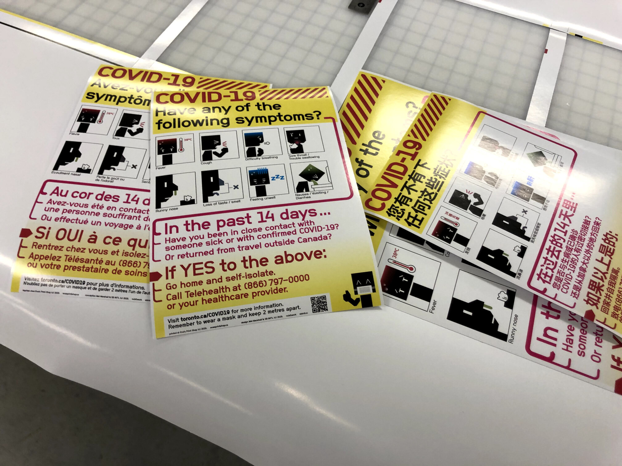
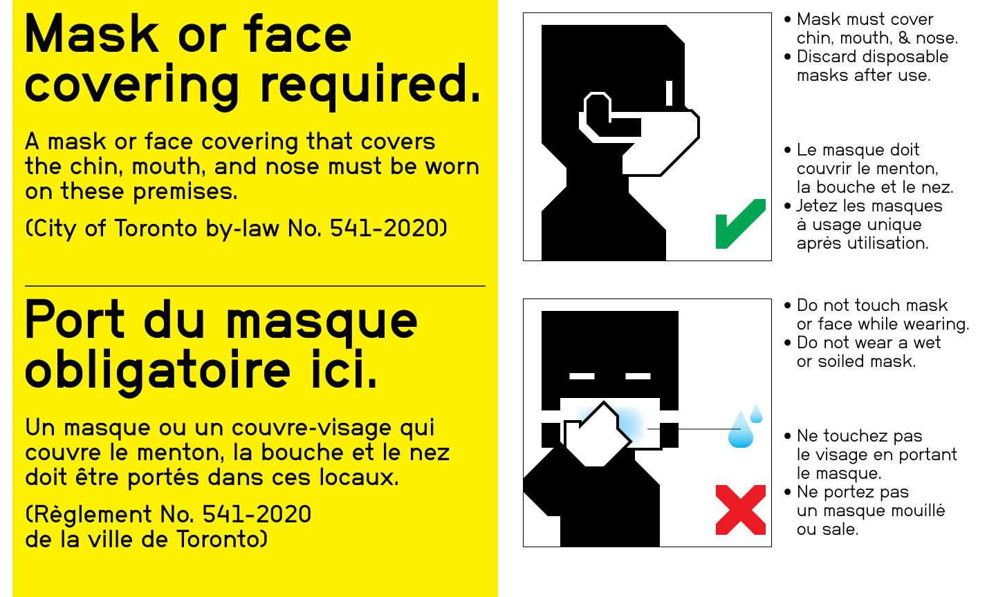
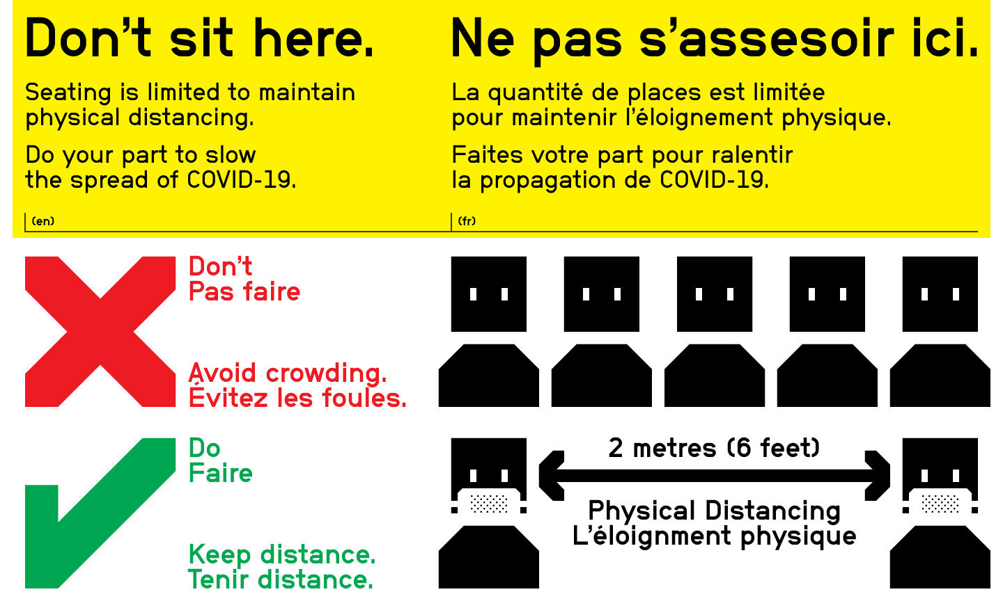
These screening posters are my personal favourite:
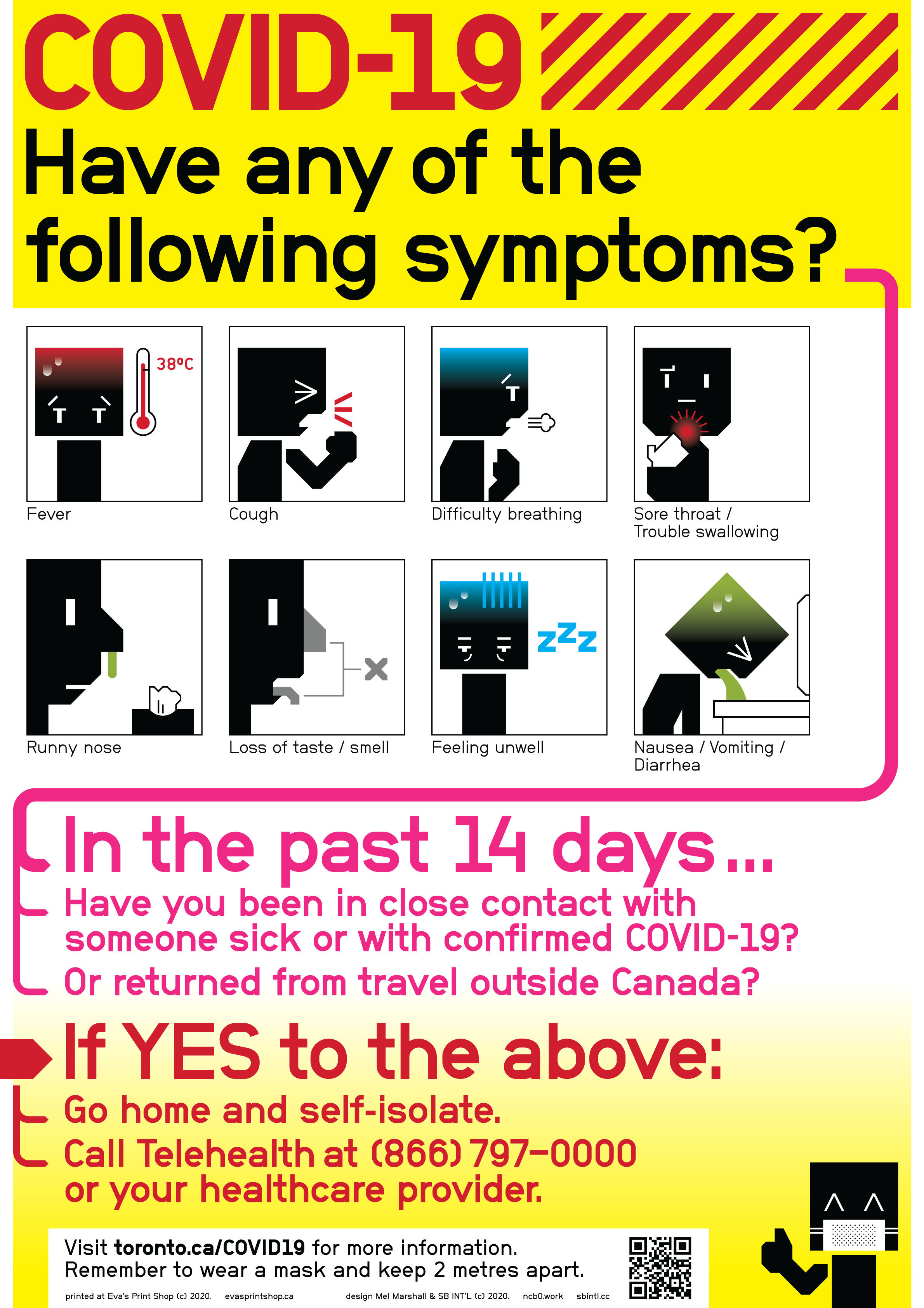
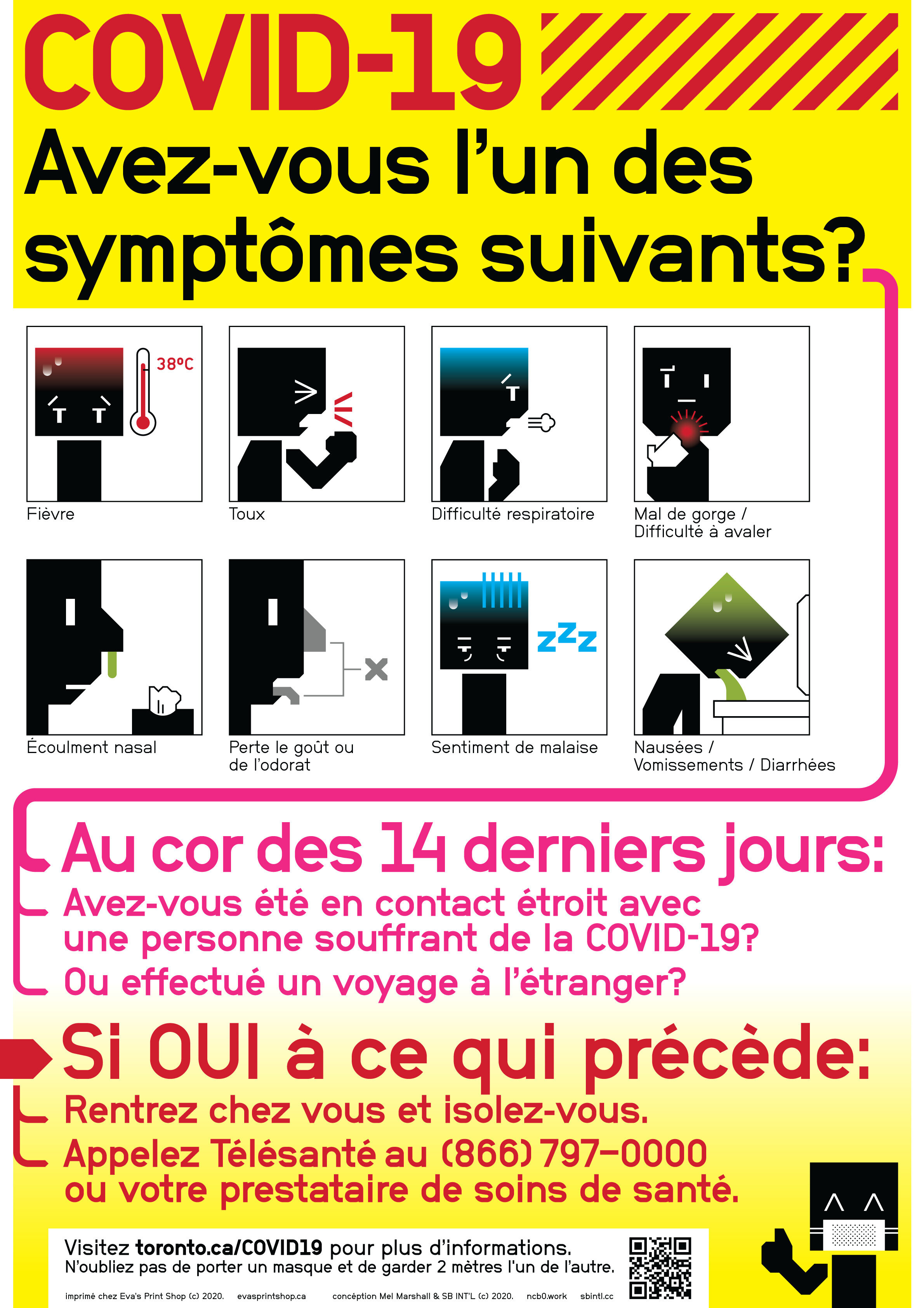
For the overall style and layout, I had The Designers Republic and Build’s old work at the front of my mind. For the iconography, I was thinking of Otl Aicher’s pictograms for the Munich Olympics. To top off the noughties-inspired look, it’s all typeset in a pirated copy of Neubau Grotesk.
The screening posters were the culmination of the style I began developing with the signs below:
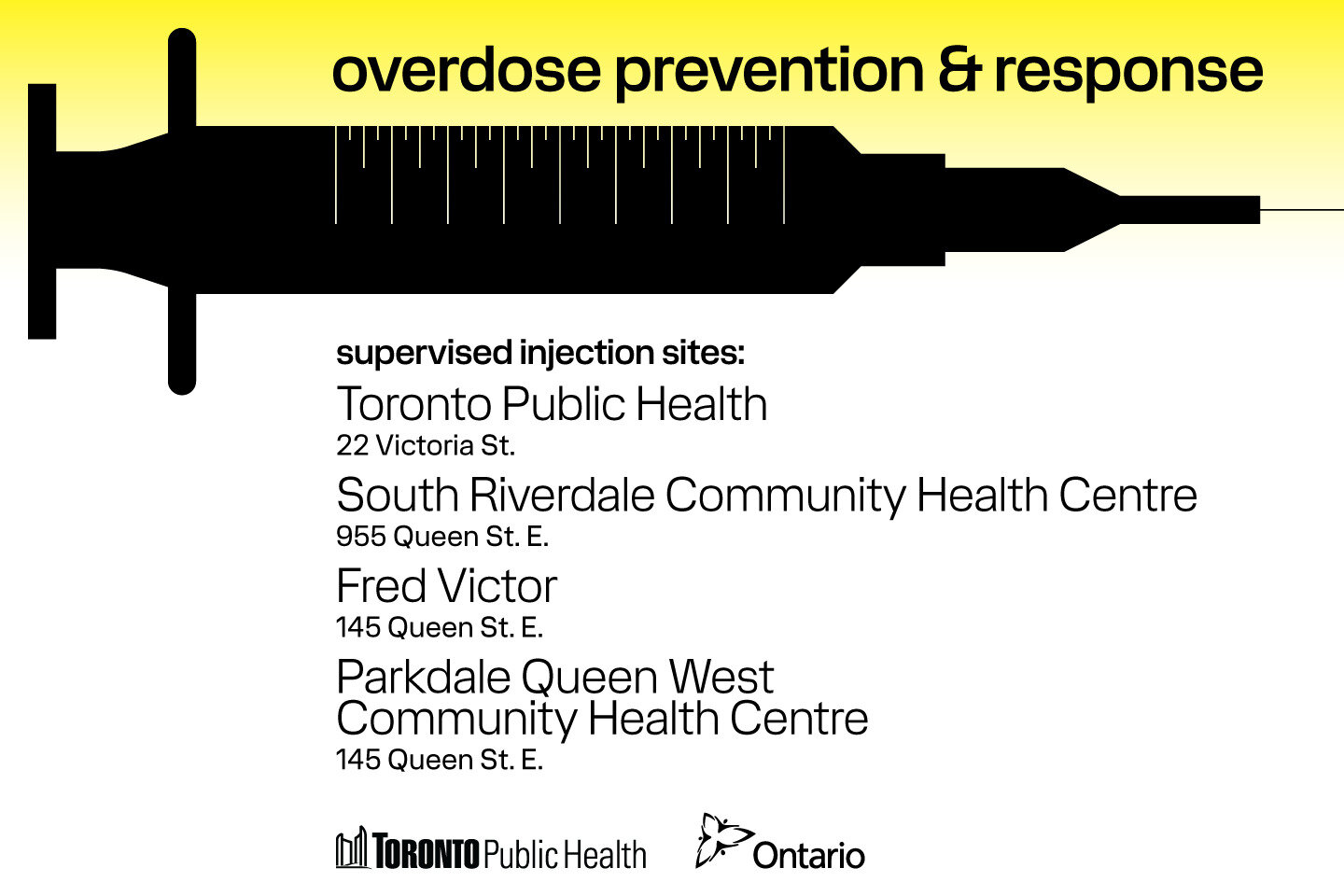
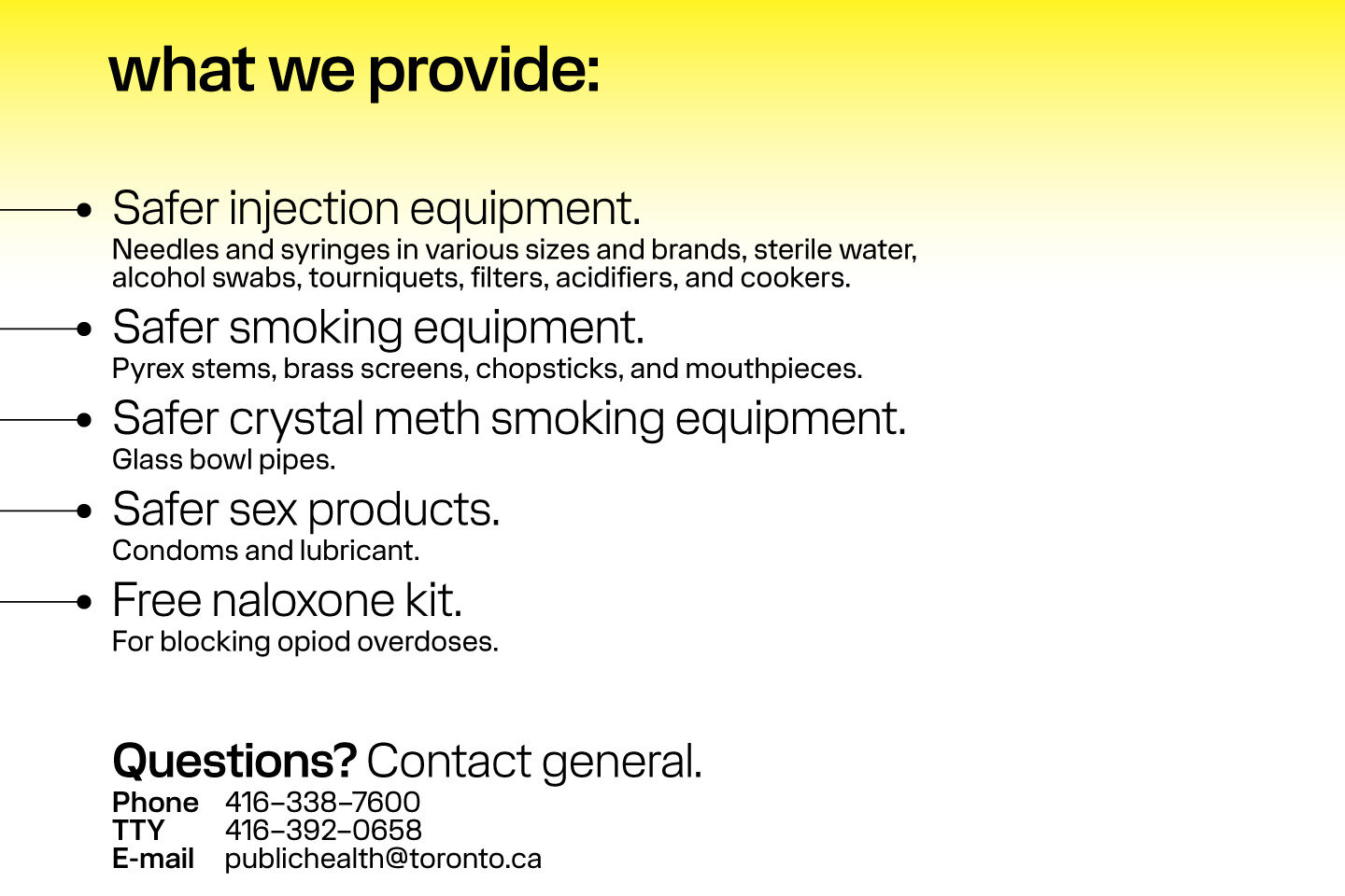
Overdose safety informational postcards (Unofficial)
Just to flex—all type on this is set in a font I designed myself, and the syringe needle on the front leads perfectly into the bullet point on the back—if you were to somehow unfold a single sheet of card…
Pins
Fonts
- NB Grotesk
- tm-mega (unreleased)
Tools
- Adobe Illustrator CC 2020